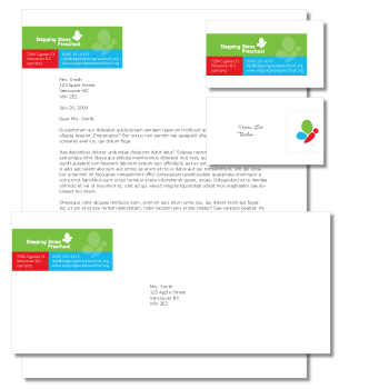
Client: Stepping Stone Preschool
Rationale: Stepping Stone Preschool had a logo from the 50s (complete with children in sailor suits), so it was high time to update their image to attract more families to register. A butterfly was chosen to represent the transformation that children can experience in a caring and stimulating environment. The mark is made up of stone-like shapes in cheerful, energetic, approachable colours, which creates a fun, fresh and professional look.