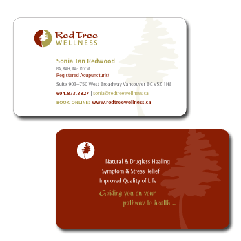
Client: Red Tree Wellness
Rationale: Red Tree Wellness combines the natural, drugless healing of Traditional Chinese Medicine with an understanding of Contemporary Western Medicine. nimble creative based their identity on the ancient symbol of yin yang; incorporating a stylized sequoia tree for which the clinic is named. The deep red and earthy green colours are complimentary and reinforce the underlying spirit of yin yang while speaking of nature, balance and life blood. Business cards and a whole page advertisement were commissioned.