Client: Extra Steps Learning Centres
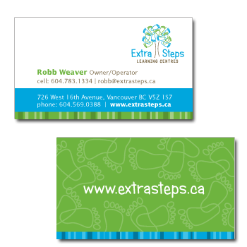
Rationale: Extra Steps has big plans for multiple preschool and childcare locations around the Lower Mainland. This identity was based around the concept of growth, as represented by a tree. The leaves are made of childlike footsteps that meander in different directions, much like a child explores both physically and in their imagination. The bright, fresh colours add energy, while the childlike font makes the identity more fun. Nimble has created postcards, advertisements and banners to help with their marketing.