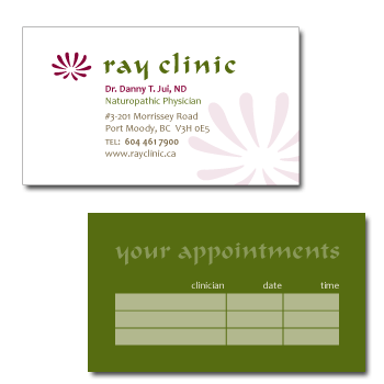
Client: Ray Clinic
Rationale: This integrative health clinic with a focus on naturopathic medicine wanted a look that was professional and caring, while sending a message of hope, health and happiness. A stylized chrysanthemum was chosen for the mark, as it has a long history of medicinal uses. Its shape creates energy flowing both outward and inward, and symbolizes that holistic health care is a two-way process between patient and practitioner.